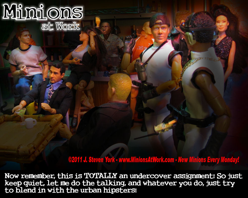
Back to the bar.
(Warning, possibly useful photo-editing geekery ahead)
I’ve used this shot in other cartoons, but it looks a lot different here. It’s because of a photo-editing technique I used on a lot of later Minions at Work cartoons that I like a lot.
Years ago I used to watch neighbor, friend, and artist Daniel Conan Young, work with scratchboard. This is a technique where a black ink or paint is applied over a lighter color base, and then scratched away to create an image. It’s fascinating to watch a skilled artist at it. It produces fine lines, and black-and-white work takes on a completely different feeling that are produced with pin or ink or paint on a white surface. Then years later, science fiction artist William R. Warren Jr. showed me a technique (which had in turn been shown to him by the great science fiction illustrator and cover artist, Frank Kelly Freas) where you use colored artist pencils on dark colored or black matt board (the stuff used around framed pictures). I used to draw most ever day. I never considered myself very good (and sadly, I’ve fallen out of the habit), but everything done using that method just looked so much better. The surface of matt board provided instant texture, and the bright colored images and lines against the dark board made them just pop. Everything looked so much more rich, alive, and professional.
There’s power in drawing light and color out of darkness, and that’s basically the technique I used here.
I started with one of my usual Minions at Work photos. They, especially the early ones, tended to be over-lit, and flatly lit anyway. So what I did was go into my photo editing program, Paint Shop Pro, and add a new layer over the image.
Then I’d make a HUGE black brush, and paint around the edges of the photo, paying special attention to dead areas, unwanted background, and anything else I really didn’t want in the shot.
Then I’d blur the black layer using a “gaussian blur.” Basically this just fuzzes the edges out into a soft halo of a size you specify, and I would go large on that. The result is a dark image that fades to black at the edges, and is dim and smoky in the middle.
Next step was to create a big eraser brush with the density control turned way down (20-30% I think) and the edge hardness set down to zero, resulting in something like a reverse air-brush, one that throws light instead of darkness. Then I would use this to paint over the areas of darkness I wanted to emphasize: Important characters (especially faces and if needed, hands), props or details I wanted to emphasize, and so on. It was like painting my photo back out of darkness.
The technique creates drama and mood. It allows you to direct attention where you want it, and hide things you want hidden. In some cases, it’s almost like lighting the picture again from scratch.
This is how I did it with Paint Shop Pro, but you should be able to do it with most any paint or photo editing program that supports layers. The tools and settings I used may have different names and slightly different settings, but the equivalent features are almost certain to be there somewhere.


Discussion ¬